これすごくよかったのでメモがてらエントリー。CSS3を使ってアニメーションするツールチップを実装することができるコードです。指定した要素にホバーするとツールチップがヒョコッと出てきます。CSSだけでできるのでサイトにちょっとしたアクセントを入れたい時なんかに役立ちそうです。
[ads_center]
やり方
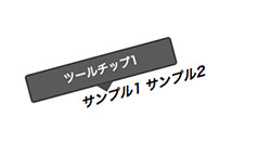
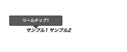
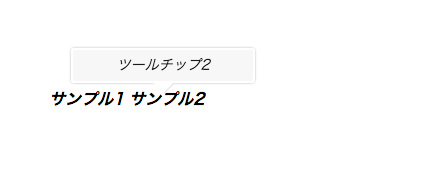
こんな感じのツールチップを実装することができます。
CSSのコードは以下。
.tooltip-container {
    /* Forces tooltip to be relative to the element, not the page */
    position:relative;
    cursor:help;
}

.tooltip {
    display:block;
    position:absolute;
    width:150px;
    padding:5px 15px;
    left:50%;
    bottom:25px;
    margin-left:-95px;
    /* Tooltip Style */
    color:#fff;
    border:2px solid rgba(34,34,34,0.9);
    background:rgba(51,51,51,0.9);
    text-align:center;
    border-radius:3px;
    /* Tooltip Style */
    opacity:0;
    box-shadow:0px 0px 3px rgba(0, 0, 0, 0.3);
    -webkit-transition:all 0.2s ease-in-out;
    -moz-transition:all 0.2s ease-in-out;
    -0-transition:all 0.2s ease-in-out;
    -ms-transition:all 0.2s ease-in-out;
    transition:all 0.2s ease-in-out;
    -webkit-transform:scale(0);
    -moz-transform:scale(0);
    -o-transform:scale(0);
    -ms-transform:scale(0);
    transform:scale(0);
    /* Reset tooltip, to not use container styling */
    font-size:14px;
    font-weight:normal;
    font-style:normal;
}

.tooltip:before, .tooltip:after{
    content:"";
    position:absolute;
    bottom:-13px;
    left:50%;
    margin-left:-9px;
    width:0;
    height:0;
    border-left:10px solid transparent;
    border-right:10px solid transparent;
    border-top:10px solid rgba(0,0,0,0.1);
}
.tooltip:after{
    bottom:-12px;
    margin-left:-10px;
    border-top:10px solid rgba(34,34,34,0.9);
}

.tooltip-container:hover .tooltip, a:hover .tooltip {
    /* Makes the Tooltip slightly transparent, Lets the barely see though it */
    opacity:0.9;
    /* Changes the scale from 0 to 1 - This is what animtes our tooltip! */
    -webkit-transform:scale(1);
    -moz-transform:scale(1);
    -o-transform:scale(1);
    -ms-transform:scale(1);
    transform:scale(1);
}

/* Custom Classes */
.tooltip-style1 {
    color:#000;
    border:2px solid #fff;
    background:rgba(246,246,246,0.9);
    font-style:italic;
}
.tooltip-style1:after{
    border-top:10px solid #fff;
}
HTMLは以下のように記述します。
<i class="tooltip-container"><b>サンプル1</b><span class="tooltip">ツールチップ1</span></i>

<em class="tooltip-container"><b>サンプル2</b><span class="tooltip tooltip-style1">ツールチップ2</span></em>
tooltipというクラス名をつけた要素がホバー時にツールチップとして表示されます。
/ Animated Tooltip with CSS / apphp-snippets – Snipt